
Table of Contents
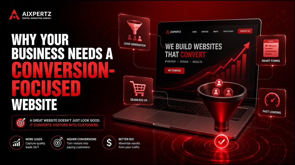
ToggleWhy Your Business Needs a Conversion-Focused Website
Picture this: You’re spending ₹50,000 a month on digital marketing. Your traffic is growing. People are visiting your site. But your phone isn’t ringing. Your contact form is empty. And your sales team is twiddling their thumbs.
Frustrating, right?
I recently spoke with a business owner in Chennai who was exactly here. “Arjun, I’m getting 2,000 visitors a month,” he said. “But I’m lucky if I get two enquiries. What am I doing wrong?”
His website was beautiful. High-quality images. Smooth animations. Award-winning design.
But it wasn’t selling.
He had a conversion-focused website problem. And once we fixed it, his enquiries went from 2 to 18 per month—without spending a rupee more on traffic.
What Exactly Is a Conversion-Focused Website?
A conversion-focused website is a digital platform carefully designed to lead users to perform specific, most valuable actions, also known as conversions . This focus attempts to link website success with established business objectives, potentially influencing the return on investment (ROI) of marketing activities .
Translation: It’s not about how many people visit. It’s about how many take action.
A conversion happens when a user completes a desired action on your site for the first time—making a purchase, filling out a lead form, or subscribing to a newsletter . A conversion-focused website is built to make that happen.
Key distinction: Most websites focus on looking good. A conversion-focused website focuses on getting results.
Why Most Websites Fail to Convert
Here’s the hard truth: Most business owners build websites around what they want to say, instead of what users need .
“Everyone loves their website and logos,” says conversion expert Onur Ibrahim, “but no one really cares. What people care about is what’s in it for them” .
The biggest mistakes I see:
No clear call-to-action – Visitors land and think, “What do I do now?”
Talking about yourself – Features vs. benefits. “We have 10 years experience” vs. “We’ll get you results in 30 days.”
Too many distractions – Navigation links, pop-ups, unrelated content pulling attention away
Mobile disaster – Half your traffic is on phones, but your site looks broken
Slow loading – Even a 100-millisecond delay can reduce conversions by up to 7%
7 Essential Elements of a Conversion-Focused Website
According to Oli Gardner, co-founder of Unbounce, there are seven principles of conversion-centered design . Here’s what they mean for your business:
1. Create Focus
Every fold in your website should focus on leading users to one desired outcome . When someone lands on your homepage, ask yourself: “What is the one thing I want them to do?”
Pro tip: If your answer is “sign up for my newsletter,” “book a call,” and “shop now”—you need to pick one primary goal.
2. Build Structure
How you organize information on your website impacts conversion rates . Start by identifying the key elements—like product details, images, and reviews—that guide visitors to take action.
Pro tip: Use visual hierarchy. Larger headlines, smaller subheadings, and lighter body copy guide skimming readers’ eyes toward conversion .
3. Stay Consistent
Consistency builds trust. Your brand identity—colors, fonts, and tone—should be uniform across all touchpoints to create brand recognition and build credibility .
Pro tip: Limit your font choices to two or three fonts maximum—one for headings and another for body text .
4. Show Benefits
Use more than words to highlight the benefits. Images, video, and short GIFs should clearly illustrate the value you’re offering . Research suggests that photos or videos of real people boost conversions, especially when they’re shown using your product or service .
Pro tip: Show your product in action. Lifestyle shots that show your product in use or before-and-after photos reveal impact .
5. Draw Attention
Your calls-to-action (CTAs) should naturally draw attention and guide customers to action . Effective CTAs stand out with eye-catching colors and clear language that directs users to take the next step.
Pro tip: The “best” button color doesn’t exist—contrast matters much more. Save the boldest, most contrasting colors for your CTAs .
6. Design for Trust
Leverage social proof to build trust and encourage conversions. Customer reviews are a powerful tool, with the majority of shoppers considering them before making a purchase .
Pro tip: Use trust signals like security badges, real testimonials, and client logos. These should be obvious to your visitors .
7. Reduce Friction
Make the conversion process as smooth as possible. Optimize your site for mobile, simplify forms, and eliminate unnecessary steps . Every extra form field or click is an opportunity for the visitor to leave .
Pro tip: Each field you add increases abandonment risk exponentially on smaller screens. Keep forms short .
What Makes a High-Converting Website?
Beyond the seven principles, here’s what sets a conversion-focused website apart:
Clear, Compelling Calls to Action
If someone lands on your homepage and doesn’t know what to do next, that’s a problem. Conversion-focused design makes your CTAs impossible to miss—and impossible to ignore .
Best practices:
Use benefit-oriented language (“Get Your Free Template” vs. “Submit”)
Place CTAs above the fold and at the bottom of the page
Keep a 1:1 attention ratio on landing pages: one page, one primary action
Mobile Optimization
Over half of all web traffic is mobile. If your site doesn’t perform beautifully on a phone, you’re losing leads before they even read a headline .
Pro tip: Design for mobile first. It forces you to prioritize what really matters .
Fast Load Times
Speed isn’t just a tech thing—it’s a trust thing. A slow website feels unprofessional and makes people bounce .
Quick wins:
Compress images without sacrificing quality
Use lightweight animations
Use a Content Delivery Network (CDN)
Messaging That Speaks to Your Ideal Client
If your website talks to everyone, it converts no one. A conversion-focused site speaks directly to your dream client—with language that reflects their values, goals, and pain points .
Pro tip: Don’t just have one landing page for everybody. Have multiple pages for different personas .
The Story: How One Business Doubled Conversions
Remember that Chennai business owner I mentioned? Here’s what we did:
The problem: Beautiful site, no conversions.
The diagnosis:
No clear CTA above the fold
Value proposition buried below three sections of text
Mobile version had tiny CTAs and massive forms
No social proof visible anywhere
The fixes:
Moved the core benefit and CTA higher on the page
Simplified the contact form from 7 fields to 3
Added customer testimonials above the fold
Made CTAs bigger and more contrasting
Fixed mobile responsiveness
The result: Conversions went from 2 to 18 per month—a 9x increase. And we didn’t change a single thing about his traffic sources.
How to Get Started: Your Conversion-Focused Checklist
Immediate Fixes (No Redesign Needed)
Match search intent – Ensure your headlines match what visitors searched for
Surface your value proposition higher – Move your core benefit and CTA above the engagement drop-off line
Simplify forms – Remove unnecessary fields
Add social proof – Testimonials, case studies, client logos
Make CTAs contrast – Use your boldest colors for CTAs
Check mobile – Ensure everything works on a phone
Longer-Term Strategy
Use data to guide decisions – Heatmaps, scroll depth, and session recordings show where users drop off
A/B test your changes – Test new headlines, CTAs, and layouts
Track conversion rate – Conversions ÷ Total Visitors × 100
Monitor key metrics – Bounce rate, time on page, exit pages
Conclusion: Stop Wasting Traffic
Your website isn’t just your digital business card—it’s your best salesperson. A conversion-focused website is built to do one thing really well: turn visitors into clients .
If you’re spending money to drive traffic, but your site isn’t pulling its weight, you’re not alone. A lot of business owners feel stuck because they don’t realize how much potential their website holds .
The good news: A few strategic shifts—tightening your copy, refining your design, and improving your CTAs—can totally change the game .
Ready to build a conversion-focused website and master digital marketing?
Our Digital Marketing Course in Chennai covers conversion rate optimization, SEO, Google Ads, social media marketing, and all the 2026 strategies you need to drive real business results. With live projects, agency-style training, and placement support, you’ll graduate ready to build websites that convert—not just look good.
Take the Next Step:
📞 Call: +91 6379618098
📧 Email: aixpertz38@gmail.com